onsdag 28 januari 2009

Old Header is going down.

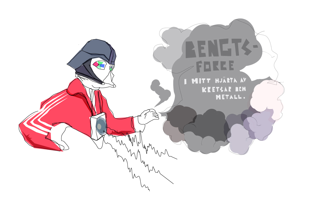
We will try to change our header once in a while, that's how you build a strong brand, isn't it?
Maybe not but it could be one way, cause instead of people rememering one logo they remember that-site-that-always-change their-header. So maybe it's just a question about what you want people to remember, the logo our the site?

tisdag 27 januari 2009

B & O & L D

Sometimes you find some letters that works very well togheter when you are trying out different styles. So good that you don't really care that it is impossible to make all letters look that good. Cause you're happy with the two words you've just designed.

Threesome

This is how it looks like when these three fonts are applied on top of each other.
And I think is beautiful, but is it art or typography?

måndag 26 januari 2009

Avocado

Found an old type I worked on some time ago, and saw that I had written AVOCADO, so here it is.

I got something up my sleeve.

Yes, I am working on a new typeface. Here is a sample. Doing to some variations to.

A Letter comunicates better than you think.

Another logodesign tip. Try to make a letter in the word/brand you are working with a look like what it the word means. I did these four examples on a short train trip yesterday. I promise you, it's easy.

Bengtsfors

måndag 19 januari 2009

I have found my G spot

I really like G's! Right now I think it's the nicest letter to paint.
So here is a selection of some of them I painted tonight.

söndag 18 januari 2009

We love Casio watches.

lördag 17 januari 2009

fredag 16 januari 2009

Mannaminne


If you think you have a too childish logo, you can always make it plain black on white to make it more serious. An d if you have a logo that looks to agressive you can always fill it with colors to make it a bit "kinder" What I really want to say is, -"The color of a logo could be more important then you think". Think about that. Like I did when I created this Mannaminne logo.

FONT: Weird Beard - In Progress

Working on this Beardy Logo for a Friend. So I am trying to create a beardy font to write it with. Here shown beard on beard.

torsdag 15 januari 2009

TYPEFACEBOOK


One word says just as much as one picture

A good thing to think of when making typographic logos or any kind of logo is to see if you can make the letters in the word form some kind of object.

onsdag 14 januari 2009

hello

We are up to something big.

Überman - The most infamous Überhero

Do you like Superman, Batman, Spiderman or Iron Man? Yeah!
Have you ever heard about Überman? Probably not, and you probably never will.
Okey...

FONT: TRIANGULAR

tisdag 13 januari 2009

LIVE EVIL

Seriously man, or woman. Don't! Be nice to everybody.

Egg Nogg

This one is dedicated to Plupp. And of course all of you at Egg Nogg Utd.
'Cause it's the best thing to drink, ever. Or acctually I have never tasted it, but it sounds so cool.
Some day, Yeah some day I am going to try it.

DEATH BREATH

Almost white on white canvas.

Space

B is for Candice


Good old Candice, so funky that Burger King uses the font for their ice cream.
No, seriously it's a lovely font to work with som times. When you feel a little bit to funky and don't know what you should do with that funky feeling. 

Mom!

Oh la la, advertising for a typeface.
Doesn't happen every day.


WE.

ARE.

LIVE.