Visar inlägg med etikett Fonts. Visa alla inlägg
Visar inlägg med etikett Fonts. Visa alla inlägg
måndag 13 juli 2009

onsdag 10 juni 2009


måndag 20 april 2009

torsdag 26 februari 2009
CLOUD

Today I visited a website with a logo I really really didn't like. So designed a new one just for fun.
Original is here : http://www.cloudclub.com/
fredag 6 februari 2009
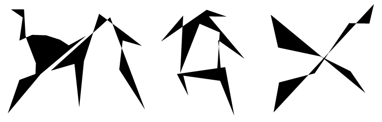
Max Headline
torsdag 5 februari 2009

onsdag 4 februari 2009

tisdag 3 februari 2009

måndag 2 februari 2009

söndag 1 februari 2009
Ta det lugnt
 This friday I was at a concert with a band called Dungen, it was the best concert i ages, truly awsome. And one of their best songs is called "Ta det lugnt", which means "Take it easy", and this is my tribute to Dungen.
onsdag 28 januari 2009
Old Header is going down.
 We will try to change our header once in a while, that's how you build a strong brand, isn't it?
Maybe not but it could be one way, cause instead of people rememering one logo they remember that-site-that-always-change their-header. So maybe it's just a question about what you want people to remember, the logo our the site?
tisdag 27 januari 2009
B & O & L D
 Sometimes you find some letters that works very well togheter when you are trying out different styles. So good that you don't really care that it is impossible to make all letters look that good. Cause you're happy with the two words you've just designed.
Threesome
 This is how it looks like when these three fonts are applied on top of each other.
And I think is beautiful, but is it art or typography?
måndag 26 januari 2009
Avocado
 Found an old type I worked on some time ago, and saw that I had written AVOCADO, so here it is.
I got something up my sleeve.
 Yes, I am working on a new typeface. Here is a sample. Doing to some variations to.
A Letter comunicates better than you think.
 Another logodesign tip. Try to make a letter in the word/brand you are working with a look like what it the word means. I did these four examples on a short train trip yesterday. I promise you, it's easy.
söndag 25 januari 2009

fredag 23 januari 2009

fredag 16 januari 2009
Mannaminne

If you think you have a too childish logo, you can always make it plain black on white to make it more serious. An d if you have a logo that looks to agressive you can always fill it with colors to make it a bit "kinder" What I really want to say is, -"The color of a logo could be more important then you think". Think about that. Like I did when I created this Mannaminne logo.
FONT: Weird Beard - In Progress
 Working on this Beardy Logo for a Friend. So I am trying to create a beardy font to write it with. Here shown beard on beard.
Prenumerera på:
Inlägg (Atom)